Every year it’s exciting; what would the colour of next year? For the colour trend 2021 it will be a double celebration! The international colour institute Pantone publishes the annual colour forecast and, as usual, one colour was expected. The colours are the opposite of each other. This creates a beautiful combination of “strength” and “optimism”. There are in fact two colours that have been chosen as the colour of the year. These are the energetic colour yellow and the powerful colour grey. Why these two colours? We will explain it to you right away.

Sunny side up
In these uncertain times, everyone needs a helping hand. The colour trend 2021 stands for cheerfulness, energy and optimism is of course: Yellow! In addition, we become active from the colour yellow and it is, of course, the colour of the sun. Long story short: This is exactly what we need in these uncertain times. Since it takes a while before the sun shines longer during the day, it is important that the colour naturally returns in objects in everyday life. How nice it is when you can create the sun by yourself in the house by, for example, our yellow Trigami hanging lamp by Sabine van der Ham? Or, with the yellow Twisted candlestick by Ward Wijnant? Another item that shouldn’t be missing from a woman’s wardrobe is of course Keechie’s yellow Lunch Break Shoulder Bag, which you can take with you wherever you go.
Shades of grey
A colour trend 2021 that you can always incorporate into both the interior and the wardrobe is of course: Grey! Grey stands for stability, elegance and security. Grey radiates power and is the colour of the variable, such as mist, smoke and clouds. Power provides a grip and certainly in these uncertain times this is indispensable. To ensure that you can incorporate this colour into your daily life, we have listed a few indispensable items for you. Think, for example, of Diederik Dam’s and Timo Keultjes’ Piglet, or the Vanishing Point Necklace that is characterised by a special perspective.
Balance is more
The paint manufacturers Histor and Flexa are also throwing their predictions to the wind fort he colour trend 2021. They both make a different prediction than Plantone and they each choose a different colour trend for 2021, but both colours certainly come close to each other.
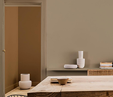
Histor defines their colour ‘Transcend’ as the colour for 2021. This is a warm, soothing tan and is a bit in between nostalgic and cosy. According to the experts, this colour can be nicely combined with white or warm shades of grey. Do you need inspiration for specimens that meet these requirements? Think for example of the Tektonische Vases by Charlotte Landsheer.
Flexa defines their colour ‘Brave Gound’ as a colour for 2021. Like ‘Transcend’ it is a warm, natural shade of brown. It creates balance in every room. Their prediction reflects the atmosphere of the moment: we all look again at what really matters in our lives. Embracing change requires courage and our homes provide a solid and supportive basis for creativity. With this colour you can go in many directions, so it is nice to combine it with striking colours such as pink and red. Think for example of the Dance Table of Ignore. It can also be combined with greens and blues. The Delft blue range will do well here.
Of course we at Holland Design & Gifts have a nice assortment of Delft blue articles. Are you curious about our assortment? Then take a look at shop.holland.com